Acoustic panels solve real problems in a home office, but they can also make the room look like a rehearsal space if you slap them up without a plan. The good news is you can get the acoustics you want while building a look you actually enjoy living with.
Most people start with performance and then try to hide the panels later, which is backwards if you care about aesthetics. If you plan the acoustic panels aesthetic home office look up front, you can make the panels part of the design instead of an apology.
I’m picky about this because home offices pull double duty, they are workspaces and they are also the background for calls. When panels look intentional, the room reads calmer and more expensive, even if the panels are DIY.
This article sticks to choices that keep absorption strong, like fabric type, thickness, and placement. It also calls out the stuff that mostly does not matter for sound, so you can focus your effort where it counts.
What design choices affect sound (and which don’t)
The big performance levers are panel thickness, air gap, and where you place panels relative to first reflection points. If you change those, you change how your room behaves in a way you can hear on meetings and recordings.
Thickness is the easiest knob to understand, because thicker panels generally absorb lower frequencies better than thin ones. A 4-inch panel is usually more forgiving than a 2-inch panel if your voice sounds boxy or your room rings.
Air gap is the quiet upgrade people skip because it feels like a mounting hassle. Even a small gap behind a panel can improve absorption in the lower mids, which is where many home offices sound muddy.
Placement matters because sound does not bounce evenly off every surface, it has predictable reflection paths. If you treat the wrong wall beautifully, you can still end up with harsh early reflections right at your ears.
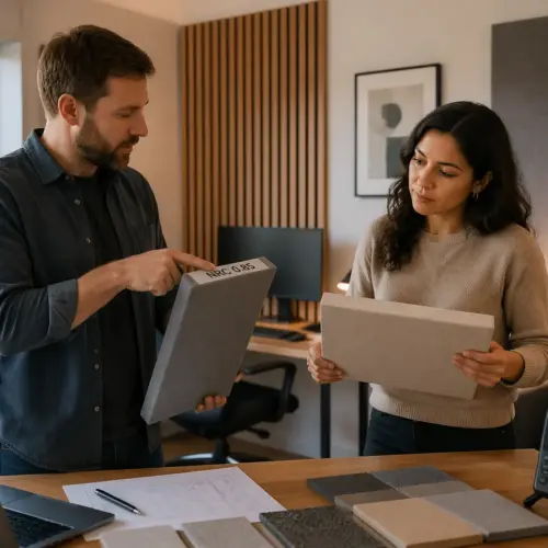
Fabric choice matters more than people think, because some “pretty” fabrics block airflow and reduce absorption. If you can’t easily breathe through the fabric when you hold it to your mouth, it is probably too tight for a broadband panel.
Some upholstery fabrics look perfect in a swatch but behave like a thin tarp when stretched over insulation. You can still use them for decorative trim or borders, but the main face should stay breathable.
Printed fabrics can work if the base cloth is acoustically transparent and the ink is not a thick coating. If the print feels rubbery or glossy, it can start acting like a reflector at higher frequencies.
Color almost never changes performance in a meaningful way, unless it comes with a coating or backing that seals the surface. A black Guilford of Maine style fabric and a light oatmeal fabric can measure basically the same if the weave and backing are similar.
That is why you should feel free to choose color based on the room, not based on myths about “dark absorbs sound.” Sound absorption is about air movement through fibers, not about how the panel looks in a photo.
Patterns also do not change sound in any meaningful way as long as the fabric stays breathable. A subtle herringbone weave can look more finished than a flat cloth without costing you performance.
Frame shape and edge details are mostly visual, as long as you don’t wrap the panel in plastic or add a hard face that reflects highs. You can bevel edges, add a thin trim ring, or use a shadow gap and still keep the panel doing its job.
Hard decorative elements become a problem when they cover too much of the front surface. A thin wood perimeter can look high-end, but a big wood lattice across the face starts turning absorption into reflection.
Panel density and core material matter, but most people are choosing between a few common options like mineral wool and fiberglass. If you pick a proven acoustic core and keep the face breathable, you are already ahead of most “decor panels” sold online.
Room layout choices also affect sound, even if they are not panel choices. A big empty desk surface, bare floors, and a glass door can undo some of the calm you are trying to build with panels.
That said, you do not need to treat every inch of the room to get a professional result. A few well-placed panels and one or two soft furnishings often beat a wall covered in thin foam squares.
Picking colors and textures that fit your office style
Start by deciding if you want panels to blend in or stand out, because that choice drives every other move you make. In a lot of home offices, blending looks cleaner, but a controlled accent wall can look great if the rest of the room is simple.
Blending usually means staying close to your wall paint color and using texture to keep things from looking flat. Standing out usually means higher contrast, but it still needs repetition elsewhere so it does not look random.
If you have a small room, blending is often the safer move because it keeps the walls visually quiet. In a larger room, a bold panel wall can actually make the space feel more anchored and intentional.
For panel color schemes, I like pulling from what is already “fixed” in the room, like wood floors, a rug, or a big bookcase. If your desk is walnut and your rug is cream, a warm gray or flax fabric looks natural and avoids the cold studio vibe.
Look at the undertone of your neutrals, because beige, greige, and gray can clash even when they all read as “neutral.” If your paint leans warm, a cool gray panel can make the wall look slightly dirty by comparison.
If your room has a strong color already, like a deep blue chair or a green plant-heavy corner, you can echo that color in the panels at a lower saturation. Muted versions of a color tend to look more expensive than bright versions on a big surface.
Texture is your secret weapon, because it adds depth without shouting for attention. Linen like acoustically transparent fabric, heathered weaves, and subtle felted looks read softer on camera than flat, uniform cloth.
Texture also hides minor DIY imperfections, like a slightly uneven staple line or a frame that is not perfectly square. A perfectly flat, tightly woven fabric shows every ripple and shadow, which is not what you want behind you on calls.
If you live with pets or you tend to brush against panels when you walk by, pick a fabric that does not snag easily. Some open weaves look great but can catch claws or Velcro and start to look tired fast.
If you want dark panels, choose a dark that matches something else in the room, like a monitor bezel, a chair frame, or a black shelf. Random black rectangles on a white wall can look harsh, but black that repeats elsewhere looks intentional.
Charcoal is often easier than pure black because it has a softer edge and shows less dust. It also plays nicer with warm woods, which is a common home office material.
Light panels can look airy, but they can also show shadows and marks more easily. If you like the light look, consider a speckled or heathered light fabric that hides small scuffs and fingerprints.
Think about the camera view when you choose color, because webcams compress contrast and can make subtle differences disappear. A panel that looks like a perfect match in person may look like a different color entirely under your call lighting.
If you are unsure, order swatches and tape them to the wall for a few days. Morning light, evening light, and monitor glow can all shift how the fabric reads in a way you will notice once you start working in the room.
Turning panels into “wall art” with clean layouts
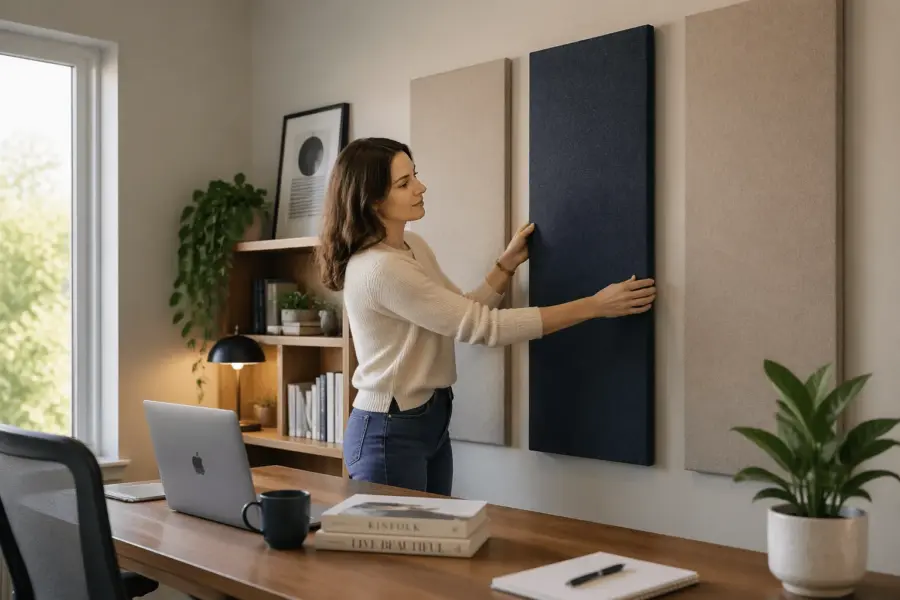
Acoustic art panels work when the layout is disciplined, not when every panel is a different size and angle. A simple grid or a clear centerline makes the wall feel designed, even if the panels are plain fabric rectangles.
Discipline can be as simple as choosing one panel size and sticking to it everywhere you can. When every panel shares the same dimensions, your brain reads it as a system instead of a patch job.
Symmetry is your friend in offices because it feels stable and calm, especially behind a desk. Even if the room is not perfectly symmetrical, you can create a symmetrical panel layout within the camera frame.
A minimalist panel layout usually looks best when you leave more negative space than you think you should. You can cover the key reflection zones and still keep the wall from feeling crowded by using fewer, thicker panels placed correctly.
Negative space also makes each panel look more like an object and less like a construction material. That is the difference between “sound treatment” and “wall art” even when the panels are doing the same job.
If you are treating a small wall, consider one strong composition instead of many small pieces. A single large panel or a triptych can look like a deliberate art choice, especially behind a desk or a sofa.
When you do a grid, align it to something that is actually level, not to the ceiling. Ceilings and baseboards can be slightly off, and your grid will look wrong even if your measurements are perfect.
Spacing is part of the design, so decide it early and keep it consistent across the whole wall. A consistent gap is what makes panels feel like a collection, while inconsistent gaps make them feel like leftovers.
Try to keep panel edges aligned with other strong lines in the room, like the desk width, a credenza, or a window casing. When the geometry repeats, the room looks planned even if you are mixing old and new furniture.
If you want a more “art” look without losing performance, you can use a limited palette across multiple panels. Two or three related fabric colors in a strict layout can look like a modern textile installation.
Avoid random diagonals unless you are very confident, because they can make the room feel visually unstable. Straight lines and consistent spacing are what make acoustic panels look like design, not like gear.
| Layout approach | Best for | Notes for performance |
|---|---|---|
| 3×2 grid (six equal panels) | Clean, modern offices | Keep gaps small and center the grid on the listening position |
| Triptych (three wide panels) | Behind-desk backgrounds | Use thicker panels to cover more bandwidth with fewer pieces |
| Single large “statement” panel | Small rooms with limited wall space | Place at the strongest reflection point and add an air gap if possible |
| Staggered vertical columns | Rooms with tall ceilings | Maintain symmetry left to right to avoid lopsided imaging |
| Full-height band (wainscot style) | Traditional or transitional decor | Keep the band at ear height when seated, not near the floor |
If you are building panels yourself, plan the layout before you cut anything so you do not get stuck with odd sizes. It is easier to design around standard dimensions than to force a layout around scraps.
For a behind-the-desk wall, think about what the camera sees, not what you see from the door. A layout that looks balanced from your chair can look off-center on camera if the lens is slightly to one side.
If you have a door or closet breaking up the wall, treat each section as its own composition. Matching panel sizes across sections can still look cohesive even if the wall is not continuous.
Do not forget the ceiling if your room is echoey and you have hard floors. A couple of ceiling panels can be hidden in plain sight if you keep them aligned with the desk and light fixture.
Hiding mounts, seams, and fasteners
The fastest way to make panels look cheap is visible hardware, especially shiny screw heads and random standoffs. You can mount panels securely while keeping the wall looking clean, you just need to pick the right method early.
Early matters because some mounting methods require a frame depth or a backer board, and you cannot easily add that after the panel is wrapped. A clean mount is part of the design, not an afterthought.
French cleats work well for heavy panels and let you lift panels off the wall when you need access, but they can force a small gap at the top. Z clips and aluminum impalers sit flatter, which helps if you want a crisp shadow line.
Keyhole hangers can work for lighter panels, but they demand accurate drilling and a perfectly level reference line. If you are even slightly off, the panel will tilt and the mistake will be obvious across a grid.
If you rent or you hate patching walls, consider mounting panels on a thin backer rail that hits studs in a few places. Then you can attach the panels to the rail with hidden clips and keep wall damage minimal.
If you want a floating look, build a consistent air gap using spacers at the corners and keep the panel edges straight. A uniform 1 to 2 inch gap can help low frequency absorption a bit, so the clean look can also be a performance win.
The trick is making the gap look intentional, which means the panel needs to sit parallel to the wall. If one corner is closer than the others, the shadow line will call attention to the mistake.
Seams look messy when the spacing is inconsistent, so measure and mark a baseline with painter’s tape before you drill anything. I also like leaving a deliberate 1 inch reveal between panels, because “intentional spacing” reads better than “almost touching.”
Use a laser level if you have one, because it removes a lot of guesswork and prevents small errors from stacking across multiple panels. If you do not have one, a long level and a pencil line will still get you most of the way there.
Pay attention to fabric wrap on the edges, because bulky corners can make panels look puffy and uneven. Clean corners and tight edges read like furniture upholstery, which is a good visual reference for a home office.
If you are adding trim, keep it thin and consistent so it frames the panel without turning it into a heavy object. Thick trim can look like a picture frame, which is fine, but it can also start to feel dated if the room is modern.
Try to avoid adhesive hooks for anything heavier than a very light panel, because sagging is a slow-motion disaster. A panel that droops over time will ruin the clean layout even if it started perfectly aligned.
If you need panels to be removable, test the removal process before you mount the whole wall. Some clip systems are great in theory but frustrating when you are standing on a chair trying not to scratch paint.
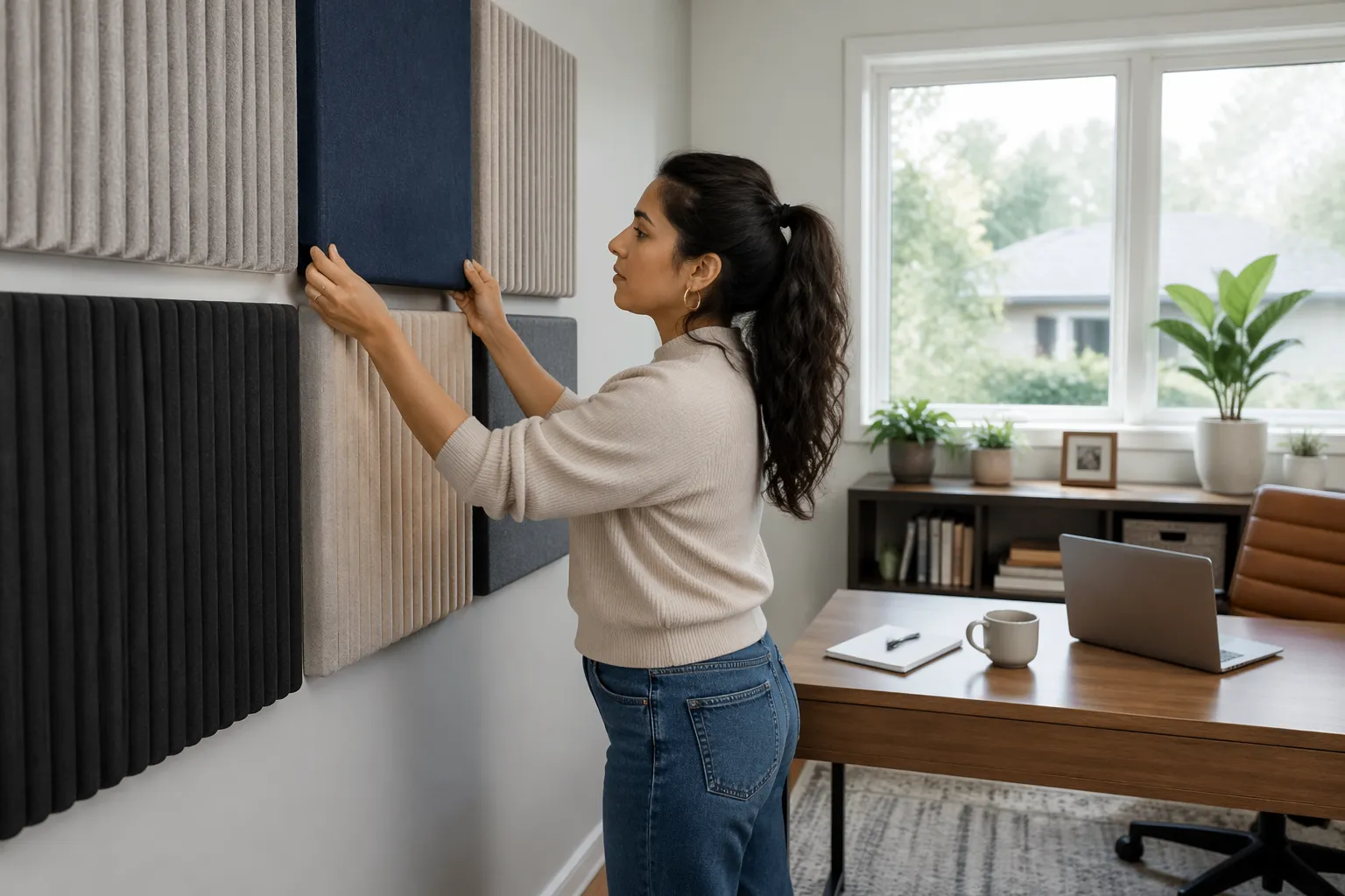
Mixing wood slats and fabric panels carefully
Wood slat walls look great in home offices, but people confuse them with absorption panels and then wonder why the room still sounds sharp. Slats are usually a mix of reflection and absorption, and the backing material decides how useful they are.
If the backing is thin felt and there is no real absorber behind it, you will mostly tame a little bit of high frequency splash. If you want the slat wall to do real acoustic work, you need depth and a proper absorber behind the slats.
If you mix slats and fabric panels, pick one as the “main” visual and let the other support it. A slat feature wall behind the desk can pair nicely with fabric panels on the side walls, where you need first reflection control.
This approach also keeps the room from looking like a showroom for acoustic products. One feature element and a few supporting treatments usually look more residential and less like a studio build-out.
Watch the wood tone, because warm oak slats can fight with cool gray fabrics and make the room look mismatched. If your slats are light, a sand, putty, or warm gray fabric usually looks better than charcoal.
If your slats are dark walnut, you can go darker on the fabric without the room feeling heavy. The key is making sure the undertones agree, so the wood and fabric feel like they belong in the same palette.
Don’t cover every surface with texture, because the room starts to look busy fast. I like one wood moment, one fabric moment, and then plain painted drywall to give your eye a place to rest.
That plain wall space also helps your panels read as intentional objects instead of a continuous wall covering. In a home office, a little restraint goes a long way toward making the room feel premium.
Be careful with slats on the wall that is directly behind your microphone, because they can add a subtle brightness if they are mostly reflective. If your voice sounds a little sharp, move absorption closer to the mic position and let slats live elsewhere.
If you want the slat look but need more absorption, you can hide fabric panels in adjacent zones and keep the slat wall as the visual centerpiece. Most people will not notice the acoustic strategy, they will just notice the room feels calmer.
Try to keep the slat spacing and the panel spacing from competing with each other. If the slats are tight and busy, keep the panel layout simple and minimal so the wall does not turn into visual noise.
Also consider maintenance, because slat walls can collect dust in the grooves over time. A fabric panel wall is usually easier to vacuum lightly, especially if you choose a fabric that does not attract lint.
Coordinating panels with lighting and background for video calls
Video calls change how you should think about acoustic panels aesthetic home office decisions, because the camera exaggerates contrast and makes clutter obvious. A tidy panel layout can make your background look calmer than a wall full of shelves and random art.
It also helps your face stand out, which is the whole point of a good call setup. When the background is controlled, your camera exposure and autofocus behave better.
Matte fabrics look better on camera than anything with sheen, because shiny threads catch key lights and create hot spots. If you use a ring light or a strong desk lamp, test it at night and look for glare on the panel surface.
Glare is not just ugly, it can make your webcam hunt exposure and turn your skin tone weird. A fabric that looks fine in daylight can suddenly sparkle under an LED key light.
Keep the strongest light source slightly off axis from the camera, so your panels and your face both read evenly. If you light from the side, textured fabrics show depth and stop the wall from looking like a flat gray sheet.
If you have panels directly behind you, consider adding a soft backlight or lamp in the corner to separate you from the wall. That little bit of depth makes the whole setup look more intentional, like you meant to design a background.
Background color matters for skin tone, so avoid super saturated colors right behind your head unless you know your camera settings well. Warm neutrals and muted greens tend to look good with most webcams and do not create weird color casts.
Muted blues can also work, but very bright blues can push your camera toward an unnatural white balance. If you love color, keep it slightly off to the side so it reads like decor instead of a halo around your head.
Think about what happens when you share your screen, because your face becomes a small box and the background still shows. A clean panel layout reads well even at small sizes, while clutter turns into a noisy blur.
If you wear patterned clothing often, avoid highly patterned panels behind you because the overall image can feel too busy. A simple background makes your wardrobe choices easier, which is a practical win if you are on calls every day.
Also watch for moiré, which can happen with tight fabric weaves and certain camera sensors. It is not super common with acoustic fabrics, but it is worth checking with your actual webcam before you commit to a full wall.
If you use a green screen sometimes, keep panels out of the green screen area or choose a neutral fabric that will not confuse the key. A soft gray panel wall can be a better long-term background than a wrinkled green screen you only use occasionally.
A practical checklist for a polished final look
If your panels look “off,” it is usually one of a few repeat problems, like uneven spacing or a fabric color that fights the room. A checklist keeps you from obsessing over tiny details while missing the obvious stuff.
Most of the time the fix is not expensive, it is just a little more measuring and a little less improvising. A clean install is basically a series of small, boring decisions done consistently.
Print this list and walk the room with a tape measure, because your eyes lie when you stare at a wall too long. Fixing layout mistakes after you mount everything is annoying, so it pays to slow down here.
Take a few phone photos from the doorway and from your webcam position, because photos reveal alignment issues fast. If something feels slightly crooked in a photo, it will feel even more crooked once you notice it every day.
Do a quick sound check before you commit, because you might need fewer panels than you think if you place them well. It is easier to add one more panel later than to remove a wall of panels because the room feels visually heavy.
If you are doing DIY panels, build one prototype first and live with it for a week. That one test panel will teach you more about fabric choice and edge details than any product photo online.
- Confirm first reflection points before final placement
- Use one consistent gap between panels across the wall
- Pick panel color schemes that repeat an existing room color
- Choose breathable, matte fabric with no plastic backing
- Hide hardware with cleats, Z clips, or recessed keyholes
- Align panel edges to a level reference line, not the ceiling
- Check the wall on camera with your usual call lighting
After you install, do one more pass for small visual distractions like frayed fabric edges or staples that are barely visible from the side. Those tiny things are what separate a DIY look from a finished look.
Finally, listen for what changed and make sure you like it, because a room can be too dead if you overdo it. The goal for a home office is usually clear speech and less fatigue, not total silence.
Conclusion
Good looking panels come from treating acoustics and design as one project, not two separate problems. When you plan placement first and then choose finishes that match your room, performance stays strong and the office looks intentional.
Use clean layouts, repeat colors already in the space, and keep mounts invisible, and your panels stop looking like gear. If you want the “art” effect, acoustic art panels and a minimalist panel layout can look sharp without sacrificing what the panels are supposed to do.
The best part is that you do not need a studio budget to get there, you just need a plan and a little patience. When the room sounds better and looks better at the same time, you will actually enjoy being in it, which is the whole point of a home office upgrade.