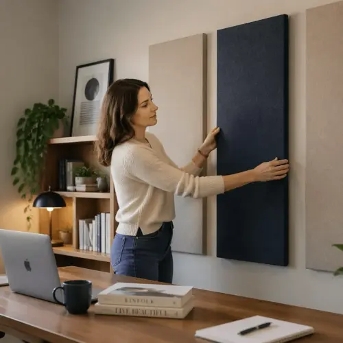
Acoustic panels work best when you treat them like both a sound tool and a wall layout, because your eyes and your ears will judge the result every day. If you have ever hung panels randomly and wondered why the room still sounds “boxy,” spacing is usually part of the reason.
People fixate on total coverage, but acoustic panel spacing on wall changes where absorption happens and how evenly the room behaves. In a home office, that matters because you sit close to boundaries and you hear early reflections more clearly than you would in a bigger studio.
There is also the practical side, panels need to clear outlets, art, shelves, and whatever cable mess lives behind your desk. A good plan balances acoustic goals with a layout that looks intentional instead of improvised.
Spacing decisions also affect how you use the room day to day, like whether you can open a cabinet door, move a chair back, or mount a monitor arm without bumping into a thick frame. When the install respects how you actually work, you are more likely to keep it up and maintain it.
Home offices are often multi use rooms, so the same wall might be your video call background, your reading nook, and your workout corner. A spacing plan that looks clean on camera and still controls reflections is a better long term win than a wall that looks like a temporary recording booth.
The goal is not to make the room silent, it is to make it predictable so your voice, speakers, and headphones translate more consistently. Spacing is one of the few variables you can adjust without changing the panel itself, so it is worth thinking through before you drill holes.
Spacing vs coverage: what actually changes acoustically
Coverage is the total square footage of absorption you add, and that mostly controls overall decay time in the mid and high frequencies. Spacing changes how that absorption is distributed, which affects how consistent the response feels as you move your head and as reflections bounce around the room.
If you cluster panels into one tight block, you create one very “dead” reflection zone and leave other paths untouched. That can still help, but it often leaves the room sounding uneven, with one side controlled and the rest still splashy.
When you spread panels out, you tend to reduce strong, discrete reflections from multiple angles rather than fully killing one angle. For voice calls and podcasts, that usually reads as clearer consonants and less comb filtering in the 1 kHz to 6 kHz range.
There is a limit, because too much spacing can leave big reflective patches that behave like mirrors at higher frequencies. I prefer to think in terms of “no large uninterrupted hard rectangles near the mic path” rather than chasing a perfect percentage number.
Spacing also changes how flutter echo behaves, because flutter is basically a ping pong between two parallel hard surfaces. If your panels are concentrated in one spot, you can still have a clean untreated lane where the flutter survives.
Even in a small room, reflections come from more than just the wall behind your monitor, because side walls, the ceiling, and the wall behind you all contribute to what you hear. Spacing panels across the most active surfaces helps the room feel less like it has one “good” direction and one “bad” direction.
Another way to think about it is that coverage is the amount of absorption, while spacing is the map of absorption. A decent map can make a moderate amount of coverage feel more effective than a larger amount placed in the wrong pattern.
If you do any mixing or critical listening, uneven spacing can also make your tonal balance shift when you lean forward or turn slightly. That is frustrating because it makes you second guess your ears, even though the problem is really the room geometry and reflection distribution.
For speech, the biggest win is usually controlling early reflections within the first 10 to 20 milliseconds, because those reflections smear intelligibility. Spacing that targets multiple early reflection points tends to beat a single dense cluster, even if the cluster looks more impressive.
At very high frequencies, small gaps between panels can act like tiny reflective stripes, which is not always bad if the room feels too dull. The trick is keeping those stripes consistent so the room sounds natural rather than patchy and phasey.
Clean layout styles (grid, rows, staggered, “gallery”)
A panel grid layout is the safest choice when you want the wall to read as deliberate and balanced. Equal rows and columns also make it easier to keep left and right reflection behavior similar around a desk.
Rows work well when your panels are long rectangles, like 12 by 48 inch units, because the wall looks calmer and less busy. Two or three horizontal rows behind a monitor can look like architectural trim instead of acoustic gear.
Staggered layouts, where every other row shifts by half a panel, can break up repetitive lines and reduce the sense that you built a cubicle wall. Acoustically, the main benefit is that you avoid lining up vertical seams that can leave narrow reflection channels.
The “gallery” approach mixes panels with framed prints, shelves, or a whiteboard so the wall looks like a normal office. If you go this route, keep your absorbers at the first reflection zones and treat the decorative items as spacing fillers rather than random obstacles.
A grid tends to look best when the wall has enough empty space around it to breathe, because the negative space is part of the design. If your wall is crowded with doors and windows, a smaller grid centered behind the desk often looks more intentional than trying to fill every open patch.
With rows, you can align the top or bottom edge to something that already exists, like the top of the monitor, the height of a shelf, or the line of a chair rail. That alignment makes the panels feel like they belong in the room, even to people who do not care about acoustics.
Staggered patterns can be subtle, like shifting by a few inches, or obvious, like a full half panel offset, and both can work if the spacing stays consistent. If you do a strong offset, keep the outer edges of the whole group squared up so the wall does not look like it is sliding downhill.
The gallery style is also useful when you have to dodge practical obstacles like thermostats, light switches, and wall sconces. Instead of forcing a perfect grid, you can create a balanced composition where the panels are still doing the acoustic work and the decor hides the compromises.
If you want a cleaner background for video calls, grids and rows usually read better on camera than staggered patterns, because the lines look stable and less distracting. A gallery wall can look great too, but it needs tighter curation so it does not turn into visual noise.
Whatever style you choose, decide on an outer boundary first, like a big rectangle the whole layout lives inside. Once that boundary is set, you can treat panel spacing as an internal rhythm rather than a series of one off decisions.
It also helps to repeat the same layout language on multiple walls, even if you only use a few panels elsewhere. A small two panel row on a side wall can echo the big back wall rows and make the whole room feel designed instead of patched together.
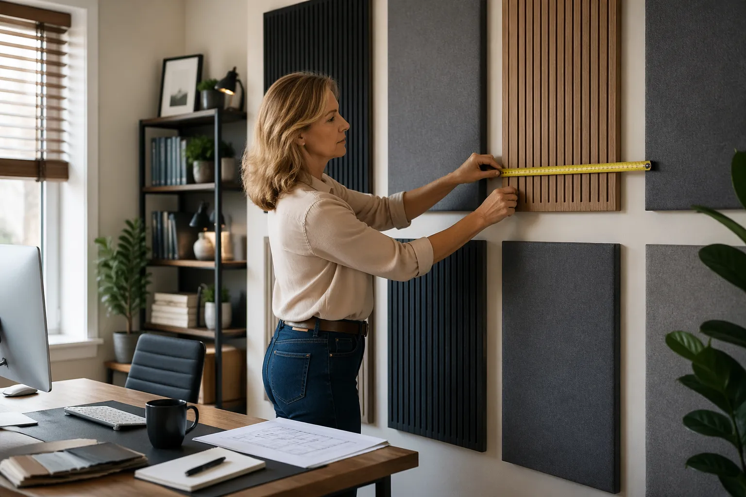
Recommended gaps between panels for home offices
For most home offices, acoustic panel spacing on wall looks clean and stays effective when gaps are consistent and modest. A gap that is too wide starts to read like you ran out of panels, and it also leaves more hard wall exposed right where reflections like to form.
Start with your panel size and trim style, because a fabric wrapped 2 inch panel can visually tolerate a tighter gap than a thick wood framed unit. I usually pick one gap dimension and reuse it everywhere, because mixed spacing almost always looks like a measuring mistake.
A practical rule is to choose a gap that you can repeat without constantly reaching for a tape measure, because consistency matters more than the exact number. If you can cut a spacer block and use it everywhere, you will get a cleaner result than eyeballing “about two inches” each time.
In a desk setup, tighter gaps often look better behind a monitor because the wall becomes one unified feature instead of a scattered set of tiles. On side walls, slightly larger gaps can be fine because you see them more in your peripheral vision than straight on.
If you are mounting panels near a corner, leave enough space that the edge does not look cramped against the adjacent wall. A little breathing room also makes it easier to dust, vacuum, or repaint without removing everything.
Try to keep the outer margins, like the distance from the panel group to the ceiling and to the nearest corner, larger than the internal gaps between panels. That hierarchy makes the layout feel framed, and it stops the wall from looking like it was filled by accident.
When you mix panel sizes, keep the gap dimension the same but let the panel edges define the rhythm, because that reads like a designed pattern. If you change both panel sizes and gaps at the same time, the wall can start to look like mismatched leftovers.
If you have baseboards, wainscoting, or picture rails, treat them as hard boundaries and avoid tiny gaps that create awkward slivers of exposed wall. Either commit to a clean margin above the trim or run a row that aligns with it so the spacing looks deliberate.
Also consider how the gaps will look with shadows, because most panels cast a small shadow line that becomes part of the pattern. In rooms with strong side lighting from a window, those shadows can exaggerate uneven spacing that you might not notice at night.
| Panel size and thickness | Good visual gap | Common use in a home office |
|---|---|---|
| 12×12 inch, 1 to 2 inch thick | 1 to 1.5 inches | Accent clusters near a mic or webcam |
| 12×24 inch, 2 inch thick | 1.5 to 2.5 inches | Side wall first reflections |
| 24×48 inch, 2 inch thick | 2 to 4 inches | Back wall behind the desk |
| 24×48 inch, 4 inch thick | 2 to 3 inches | Back wall plus low mid control |
| Custom slat or frame panels, 2 to 4 inch thick | 1 to 3 inches | Design heavy rooms with visible trim |
Use the table as a starting point, not a law, because your wall size and furniture placement can force different compromises. If the choice is between perfect gaps and actually treating the right reflection point, treat the reflection point and let the gap be slightly imperfect.
That said, if you know you are sensitive to visual alignment, choose a gap that divides nicely into your wall width so you do not end up with a weird half gap at the end. Small planning math up front can prevent the classic problem where the last panel has nowhere clean to go.
For small square panels, tight gaps can make the wall look like a textured surface, which is great if you want a subtle acoustic look. For large panels, slightly wider gaps help the wall avoid looking like one giant padded rectangle.
If you are renting and want fewer holes, larger panels with moderate gaps can cover the important zones with fewer mounting points. In that case, the spacing is less about aesthetics and more about making each panel count.
Using an air gap behind panels to boost absorption
A panel air gap is the simplest upgrade you can do when you want more absorption without buying thicker panels. By spacing the panel off the wall, you move some of the material closer to where particle velocity is higher, which improves low frequency performance for a given thickness.
For a typical 2 inch fiberglass or mineral wool panel, a 2 inch air gap is a sweet spot in a home office. You get an audible improvement in the low mids, and the mounting hardware stays straightforward with spacers or Z clips.
Do not assume bigger is always better, because a huge gap can push panels into the room and create a cramped feel near a desk chair. If you need a 6 inch total depth, I would rather use fewer but thicker panels in the worst reflection spots and keep the rest flatter.
Air gaps and panel spacing work together, because a spaced off panel already has a shadow line that reads like a design feature. When you combine a consistent wall gap between panels with a consistent air gap behind panels, the whole install looks more like built in millwork.
Air gaps are especially useful on the wall behind you if you record voice, because that surface often creates a strong reflection that comes right back into the mic. A little extra low mid absorption there can reduce the “hollow” sound that makes speech feel cheap.
If you are treating a ceiling cloud above a desk, an air gap is almost mandatory because it increases effectiveness without making the panel itself thicker and heavier. The same idea applies, but you also get the benefit of reducing reflections that bounce between the desk surface and the ceiling.
Mounting methods matter because you want the panel stable and repeatable, not hanging like a crooked picture frame. Simple wood cleats, French cleats, Z clips, or standoff bolts can all work as long as you can keep the depth consistent across the whole layout.
Consistency is important because uneven air gaps can make the wall look sloppy even if the face spacing is perfect. If one panel floats two inches and the next floats one inch, the shadow lines will not match and your eye will catch it immediately.
Air gaps also give you a hidden channel for cable management if you plan for it, which is helpful behind a desk with monitors and chargers. Just do not compress the insulation or block the back completely with plastic, because the panel still needs to behave like a porous absorber.
If you are worried about the panel sticking out, choose a slightly larger wall gap between panels so the depth reads like an intentional architectural feature. A tight face gap combined with a thick float can look bulky, while a slightly more open layout can make the same depth feel lighter.
Symmetry tips for desk-centered rooms
Symmetry in acoustics matters most around the listening position, which in a home office is usually your chair centered on the desk and monitor. If the left wall has absorption and the right wall has bare drywall, your stereo image pulls and your voice monitoring can sound lopsided.
Start by mirroring treatment at the first reflection points, then worry about the back wall and corners. A simple mirror trick works, sit in your chair, have someone slide a mirror along the wall, and mark where you can see your speakers or mic position.
Symmetry does not require identical furniture, but it does require similar acoustic behavior. If one side has a bookcase, you can often match it with a panel group on the other side so the reflection strength stays closer.
Keep your panel grid layout centered on the desk centerline when possible, because your eyes will notice a shifted pattern even if you do not measure it. If the desk is off center in the room, I still center the panel pattern on the desk, not on the wall.
When you cannot get perfect symmetry, aim for symmetry in the first few feet around your head, because that is where early reflections are strongest. You can be more flexible farther back in the room, where the reflections arrive later and are less damaging to imaging.
One common problem is a door on one side wall and a solid wall on the other, which makes it hard to match panel placement. In that case, treat the solid wall normally and use a panel on the door itself or add a freestanding absorber near the door side to even things out.
Windows can be tricky because glass is very reflective at high frequencies, but curtains can add some absorption and diffusion depending on thickness and pleating. If one side has a window, a thick curtain plus a panel on the opposite wall can get you closer than leaving the window bare.
Symmetry is also about height, because a panel at ear level on one side and a panel near the ceiling on the other side will not behave the same. When you mark first reflection points, mark vertical position too, not just left to right distance.
If you use a staggered or gallery layout, you can still preserve symmetry by mirroring the overall mass and the key reflection coverage. The wall does not need to be identical, but the acoustic “weight” should feel balanced around the desk centerline.
For people who monitor on headphones most of the time, symmetry still matters because your mic hears the room even if you do not. A balanced room tends to produce more consistent recordings, which saves you from fixing weird tonal shifts with EQ later.
Making small rooms feel larger with panel placement
Small rooms feel smaller when every surface is visually busy, and a wall packed edge to edge with panels can look heavy. Strategic spacing can make the wall read wider, especially if you keep equal margins to the corners and ceiling line.
I like leaving a clean border around a panel group, such as 6 to 12 inches from the nearest corner or trim, because it frames the treatment like a feature wall. That border also keeps panels away from corner pressure zones where thin absorption does less for bass.
Vertical orientation can add perceived height, so two tall columns of panels behind a seated position can make a low ceiling feel less oppressive. If you want the room to feel wider, use horizontal rows and keep the gaps consistent like a modern headboard wall.
Color choices matter more than people admit, because dark panels on dark paint can disappear while light panels on white walls can look like acoustic stickers. If you want the room to feel bigger, match panel fabric to the wall color and let the shadow gaps create the pattern.
Another trick is to avoid placing panels right up against the ceiling, because that can visually lower the room. Leaving a clean strip of wall at the top keeps the ceiling line clear and makes the room feel taller even when the wall is treated.
If your desk faces a short wall, a centered panel group can make that wall feel more proportioned and less like you are sitting in a closet. If your desk faces a long wall, spreading panels across a wider area with consistent gaps can make the room feel more panoramic.
In very tight rooms, fewer larger panels often look better than many small panels, because the wall reads as calm shapes instead of a mosaic. You can still get good acoustic results as long as those larger panels hit the key reflection zones.
Try to keep the panel edges aligned with other strong lines in the room, like the desk top, a shelf line, or the top of a door frame. When the geometry matches, the panels feel like part of the architecture instead of something you added later.
Lighting can make spacing feel more premium, especially if you use wall washers or a small lamp that grazes the panel texture. A consistent gap becomes a consistent shadow, and that shadow is what makes the wall look designed rather than cluttered.
If you are using plants, a floor lamp, or a tall cabinet, treat them as part of the composition and do not fight them with a rigid grid that gets chopped up. A slightly smaller but centered panel layout can look larger than a bigger layout that looks interrupted.
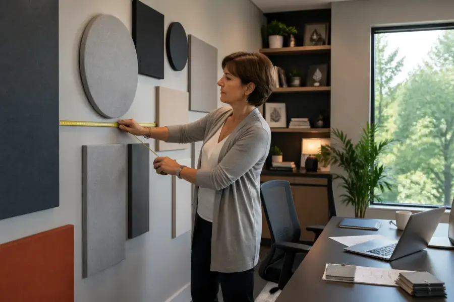
Measuring and marking without guesswork
Most ugly installs come from one problem, the first panel went up slightly off, then every other panel followed that mistake. Take ten minutes to establish a reference line, because it saves you from staring at crooked gaps for years.
Use painter’s tape to lay out the full rectangle of your panel group on the wall before you drill anything. You can stand back, check your acoustic panel spacing on wall with your eyes, and adjust margins until the pattern looks right with the desk and monitor.
A laser level is worth borrowing, especially for long rows where a small tilt becomes obvious across four feet. If you do not have a laser, snap a chalk line or use a long straightedge and a bubble level, then mark panel centers rather than edges.
Build a simple spacer block from scrap wood cut to your chosen gap, like 2 inches or 3 inches. When you hang panels, you can press the spacer between frames to keep the panel grid layout consistent without measuring every single gap.
Measure the wall and the panel group as a whole before you measure any individual gap, because you want the layout centered and balanced. If the wall is not perfectly square, centering the group visually will usually look better than forcing equal measurements from a crooked corner.
Marking panel centers is often easier than marking edges because you can use a single vertical and horizontal axis to locate each panel. Once the centers are marked, you can use the panel itself as a template to confirm that the gaps will land where you expect.
If your panels have hanging hardware that allows a little adjustment, like keyholes or wire, use that adjustment to fine tune the final alignment. If your hardware is fixed, double check every mark because you will not have much room to correct after drilling.
For rentals or anyone nervous about holes, test the layout with paper templates taped to the wall. Even rough rectangles cut from kraft paper can tell you whether the spacing looks calm or chaotic from your chair and from the doorway.
Do not forget to account for baseboards and outlet covers when you measure, because those small protrusions can force a panel to sit proud or crooked. If a panel needs to clear an outlet, it is usually better to shift the whole row slightly than to create one odd gap around that panel.
After the first panel goes up, stop and check it from multiple angles, including sitting in the chair and standing in the doorway. If the first one is right, the rest becomes a repeatable process instead of a series of tiny corrections.
Conclusion
Good acoustic treatment in a home office is a mix of smart coverage, smart placement, and a layout you can live with visually. Acoustic panel spacing on wall is where those goals meet, because spacing changes both reflection control and how finished the room looks.
If you keep gaps consistent, add a sensible panel air gap where depth allows, and respect symmetry in acoustics around the desk, your room will sound calmer and more predictable. Treat the wall like a design surface, and the panels stop looking like an afterthought.
Start with the first reflection points, then expand to the back wall and any obvious flutter echo paths. Once you hear the difference, you will care a lot less about chasing perfect coverage numbers and a lot more about placing each panel with intent.
If you are unsure, pick one wall, do a clean layout, and live with it for a week before committing to the rest of the room. It is easier to refine spacing and symmetry when you have one finished reference that shows you what your eyes and ears prefer.
The best installs look simple because the decisions were made up front, not because the room is magically easy. A little planning around spacing, margins, and air gaps turns acoustic panels into something that feels like part of the room rather than a patch for a problem.