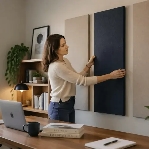
Buying acoustic panels for a home office gets weirdly confusing fast, because the sizes look similar on a product page but behave very differently on a wall. This acoustic panel size guide focuses on the real-world tradeoffs between common panel dimensions, so you can plan coverage that actually improves your room.
Most people start with sound problems they can name, like flutter echo on calls, harshness in recordings, or fatigue after a long day of meetings. The fix is rarely “more panels,” it is smarter placement and a layout that matches your desk, walls, and monitor setup.
Panel thickness options matter for performance, but size drives your layout, your seams, and how easy it is to hit the right spots. If you have ever hung two panels and thought the room still sounds “ringy,” the issue is often coverage planning, not the brand.
In a home office, you also have to live with the result, because your background is on camera and your walls are in your face all day. A clean plan beats a pile of random rectangles every time.
It also helps to remember that panels are not magic blankets for every frequency, so you are really trying to control reflections and decay time in the speech range first. When you pick panel dimensions with that goal in mind, the buying decisions get simpler.
Think of size as the “shape of your solution” and thickness as the “strength of your solution.” You can get a surprisingly good result by choosing sizes that let you cover the right zones without fighting your room.
How panel size affects placement flexibility
Smaller panels give you more placement flexibility, because you can dodge outlets, art, light switches, and wall mounted shelves. That matters in home offices where every wall has something on it.
Larger panels reduce seams and cover more area per mounting point, which makes them faster to install and easier to keep level. They also lock you into fewer layout choices, so mistakes show up immediately.
Panel dimensions also change how you treat corners and side walls near a desk, where precision matters. A long 12×48 can slide behind a monitor arm or between a door trim and a bookshelf in ways a 24×48 cannot.
When people complain that panels “did nothing,” I often see them placed too high or too far from the reflection points. Smaller sizes make it easier to center coverage at ear height, which is where the payoff usually is.
Flexibility is also about rotation, because a 12×48 can be used vertically as a narrow column or horizontally as a low band. That one decision can be the difference between treating the reflection point and treating the empty space above a cabinet.
In a home office, the first reflection points are often squeezed between a desk surface and a wall shelf, so a tall panel can be hard to fit. Smaller panel dimensions let you treat that same zone without moving furniture you actually need.
Mounting style interacts with size more than people expect, because larger panels tend to look crooked if they are even slightly off. With smaller panels, you can adjust one piece without the whole wall looking like it is leaning.
Another practical detail is cable management, since many desks have power strips and cable channels on the wall behind them. Narrow panels can be placed around those routes, while large panels often force you to choose between sound and convenience.
If you are renting, size affects how many holes you need and how easy it is to patch later. A layout built from fewer large panels can mean fewer anchors, but only if the wall cooperates and you can place them where they need to be.
Flexibility also helps when you upgrade your desk or move the room around, because smaller panels can be reconfigured like furniture. A big panel plan that looks perfect today can become awkward the moment you add a second monitor or a different shelf system.
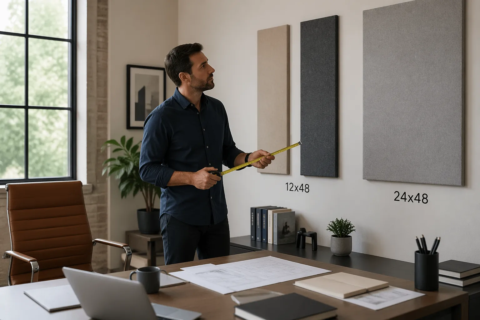
Common sizes compared: 12×48, 24×48, and squares
The 24×48 panel is the default because it is efficient, and it looks like a “proper studio” rectangle on a wall. It is also the size that most quickly becomes awkward when your wall space is chopped up by windows and cabinets.
The 12×48 panel is a layout tool more than a coverage tool, since it fits into narrow strips of wall that would otherwise stay bare. It is also great for making a symmetrical look behind a desk, especially if you want a tighter grid.
Square panels, like 24×24 or 12×12 tiles, work well when you want modular spacing or a checkerboard pattern. They can also look “crafty” fast if you do not align edges and keep consistent gaps.
From a pure coverage standpoint, two 12×48 panels equal one 24×48, but the room does not “see” them the same way if you separate them. If you split them into two vertical strips with a big gap, you might miss a reflection point you would have covered with one larger rectangle.
There is also a visual difference between one big rectangle and two small ones, even if the area is identical. One 24×48 reads as a single design element, while two 12×48 read as a pattern that needs to be repeated to look intentional.
In practice, 24×48 panels are easiest to plan when your wall has a clear center and your desk sits roughly in the middle. If your desk is offset or you have a closet door on one side, the same panel dimensions can force awkward spacing.
The 12×48 size is also useful for treating the side walls next to a desk, because those zones are often narrow and interrupted by curtains. A single vertical strip at the right height can reduce slap echo without taking over the whole wall.
Squares are great when you want to avoid the “recording booth” look, because you can space them out and let wall color show through. They are also easier to align with shelves and picture frames, which helps the room feel like an office instead of a studio.
If you are trying to keep a clean camera background, squares can be easier to frame because they naturally form a grid. Long rectangles can look slightly off on camera if the lens is wide and your wall lines bend at the edges.
Another difference is how these sizes interact with studs and anchors, since a 24×48 panel may span multiple studs while a 12×48 might sit between them. If you prefer mounting into studs, larger panels can be simpler, but only if the stud spacing lines up with your plan.
Shipping and handling are also part of the real-world comparison, because big panels are easier to dent and harder to store if you change your mind. Smaller panels are easier to move around during coverage planning, especially if you are testing positions before committing.
Choosing sizes based on desk width and wall space
Your desk width is the easiest anchor for this acoustic panel size guide, because it tells you what looks centered and what looks like an afterthought. A 48 inch wide desk pairs naturally with either one 24×48 centered panel or two 12×48 panels flanking the centerline.
Wall space is the reality check, because many home offices have a window directly behind the desk or a door swing that steals usable area. Before you obsess over panel thickness options, measure the clear rectangles of wall you can actually use at ear height.
Desk depth matters too, because a deep desk pushes you farther from the wall and changes where reflections land. If your chair sits far from the back wall, you may get more benefit from side wall panels than from stacking bigger panels behind the monitors.
Monitor height and camera height also influence the usable band, since you do not want panels to block a shelf or look like they are creeping into the webcam frame. Panel dimensions that fit the wall can still feel wrong if they crowd the visual center of the room.
If your desk is wider than 60 inches, a single centered 24×48 can look undersized, even if it helps acoustically. In that case, two 24×48 panels or a row of squares often looks more balanced while still keeping coverage planning simple.
For narrow desks, the opposite happens, because large panels can overwhelm the wall and make the setup feel cramped. A pair of 12×48 panels or a few 24×24 squares can match the scale of the furniture better.
Do not ignore baseboards, chair rails, and wall heaters, because they can steal the bottom part of your ideal placement zone. If you have to mount higher than you want, consider narrower panels so you can still keep the center of the panel near ear height.
Windows are the most common obstacle, and they often create two narrow wall columns on either side. Those columns are basically made for 12×48 panels, especially if you can mount them vertically and keep the window trim clear.
Closet doors and room doors are the second most common obstacle, because they create a no-go zone for anything that sticks out. In those cases, squares or slim panels can let you treat the wall without getting smashed by a door handle.
If you have a floating shelf above the desk, measure the clearance between the shelf and the desk surface, not just the total wall height. A 24×48 might technically fit, but it can look squeezed, while two 24×24 squares can breathe.
| Desk and wall scenario | Panel dimensions that usually fit | Layout note for coverage planning |
|---|---|---|
| 48 inch desk, clean wall behind | One 24×48, or two 12×48 | Center on the chair, keep bottom edge near shoulder height |
| 60 inch desk, window centered behind | Two 12×48 on the sides | Leave window clear, treat side reflections instead of chasing symmetry |
| Standing desk with monitor arm, narrow wall strip | One 12×48 vertical | Place at ear height where the arm does not block it |
| Corner desk, two short wall runs | Two 24×24 squares per wall | Use squares to avoid crowding the corner and door trim |
| Shared office, background needs to look tidy | Three 24×24 in a row | Keep equal gaps and align to the desk centerline |
If you are unsure, sketch the wall behind your desk and draw the desk width on the sketch, because it forces you to think in proportions. Panel dimensions that look fine in isolation can look oddly small or oddly huge once the desk is in the picture.
Also consider where you actually sit, because many people sit slightly off center due to a second monitor or a notebook area. Centering panels on the chair position can matter more than centering them on the desk itself.
When wall space is tight, it is usually better to cover the correct height in a smaller area than to cover the wrong height in a larger area. That is why 12×48 and squares can outperform bigger rectangles in messy, real rooms.
Mixing sizes for better coverage and better looks
Mixing sizes is where most home offices end up, because one wall might accept a clean row of 24×48 panels while another wall has only narrow slots. A mixed kit can look intentional if you commit to a grid and repeat the same gaps.
A common approach is to use 24×48 panels for the main reflection zones and 12×48 panels to “fill in” around obstacles. That keeps your coverage planning focused on the spots that matter while still reducing bare drywall.
Squares work best as accents or as a way to match odd wall heights, like a half wall under a sloped ceiling. If you use squares, use enough of them to form a clear pattern, because two lonely squares can look like you ran out of panels.
Panel thickness options can also be mixed, but do it with a reason, like thicker panels on the back wall and thinner panels on the side walls for looks. If you mix thickness randomly, the shadows and edge profiles make the layout look messy even if your panel dimensions are consistent.
One simple mixed-size layout is a 24×48 behind the monitors with two 12×48 panels on the side walls at the reflection points. That combination often fixes the “phone booth” harshness on calls without making the room feel over-treated.
Another approach is to build a centered block, like two 24×48 panels stacked, then use squares to extend the visual width. This keeps the main absorption in a solid mass while the squares act like a design border.
If you are trying to keep the room looking like a home office, mixing sizes can help you avoid the obvious studio wall. A few squares mixed with rectangles can read more like wall decor, especially if you keep the spacing consistent.
Be careful with mixing orientations, because rotating panels can make the wall feel busy if there is no repeating logic. If you go vertical with 12×48 panels, try to keep all of that size vertical so the pattern feels deliberate.
Coverage planning gets easier when you decide what each wall is supposed to do, like “desk wall handles early reflections” and “back wall reduces slap echo.” Once each wall has a job, the panel dimensions you need tend to reveal themselves.
Mixed sets are also helpful when you want to leave space for art or a whiteboard, because you can frame those items with narrow panels. That way the wall still feels functional, not like you sacrificed everything for acoustics.
If you are buying over time, mixing sizes can prevent the patchwork look, because you can plan the final grid and fill it in. It is easier to buy two panels now and two later when you already know what the finished wall should look like.
Try to repeat at least one element across the whole room, like the same panel width or the same gap size, because repetition is what makes mixed dimensions feel cohesive. Even a small repeating detail can make the room look designed instead of improvised.
How many panels per wall (practical examples)
People ask for a number, but the honest answer depends on wall size, speaker position, and how reflective the room is. Still, you can get close with simple math and a willingness to prioritize the first reflection points.
On a typical 10 foot wide wall, three 24×48 panels in a row cover 24 square feet, which is a strong start without turning the wall into a padded cell. If you swap to 12×48 panels, you might use six to get the same area, but you gain the ability to space them around furniture.
For a small office with an 8 foot ceiling and a 9×10 footprint, I like starting with four to six 24×48 equivalents total across the room. That could be four 24×48 panels, or a mix like two 24×48 plus four 12×48, depending on panel dimensions and obstructions.
If your problem is echo on video calls, treat the wall behind your monitors and the side wall reflections before you treat the wall behind your chair. If your problem is boomy bass from nearfield monitors, size alone will not fix it, and panel thickness options plus corner placement matter more.
As a practical starting point for call clarity, aim for enough coverage to break up large uninterrupted drywall surfaces near your speaking position. Even a few panels placed correctly can reduce the “bathroom” tone that microphones exaggerate.
If you sit close to the back wall, that wall becomes a major reflection source for your voice and for any speakers. In that setup, a couple of 24×48 panels behind your chair can be more noticeable than adding more panels near the desk.
For nearfield monitor use, the side walls are usually the first priority because early reflections smear stereo imaging. Two panels per side wall at ear height is a common move, and 12×48 panels can be easier to fit than 24×48 panels in tight rooms.
Ceiling reflections matter too, but most people skip them because mounting overhead is annoying. If you do add a ceiling cloud, squares can be easier to center above the desk without looking like a giant sign hovering over you.
In a very live room with hardwood floors and bare walls, you may need more total area than you think, but you still want to keep it targeted. A good rule is to add panels in stages and listen for the point where speech stops sounding splashy but still feels natural.
In a room that already has carpet, curtains, and bookshelves, you may need fewer panels because the room is doing some absorption and diffusion for free. In those cases, the right panel dimensions are the ones that let you treat specific reflection points without over-deadening the space.
If you want a cleaner look, you can often trade quantity for better placement by using larger panels in the most important zones. If you want maximum flexibility, you can trade larger panels for more smaller panels and treat more micro-areas around the desk.
When you are unsure, start with the desk wall and the closest side wall, because those are the surfaces your voice and speakers hit first. Once those are treated, you can decide if the remaining issues justify adding more panel dimensions elsewhere.
It also helps to walk around the room while talking and listen for where the echo is strongest, because it is often not where you expect. Those hot spots can guide how many panels you need on each wall more reliably than a generic number.
Avoiding “patchy” treatment that looks random
Patchy treatment happens when you buy panels in small batches and hang them wherever there is space that day. The room ends up with scattered rectangles at random heights, and your camera background looks like a corkboard.
The fix is to pick a reference line, usually the desk centerline or the monitor centerline, and build symmetry around it where you can. Symmetry is not required for sound, but it makes your panel dimensions read as a design choice.
Keep panel edges aligned across a wall, even if you mix sizes, because misaligned tops are what people notice first. If you need to break alignment due to a window, break it in a clean way, like stepping down in a consistent increment.
Also watch the gap size between panels, because inconsistent spacing screams “leftovers.” A simple rule is to choose one gap, like 2 inches, and stick to it during coverage planning.
Another cause of patchiness is mounting panels at random heights based on what feels convenient in the moment. If you keep most panels centered around ear height, the wall will look more coherent and the acoustics will improve faster.
Try to avoid single panels floating alone in a big empty area, because they look accidental and they often miss the best acoustic spot. If you only have one panel for a wall, center it on a meaningful anchor like the chair or the monitor stack.
Color and fabric choice can make patchiness worse if you mix too many tones without a plan. Even with perfect panel dimensions, a wall of mismatched colors can look chaotic on camera.
If you want variety, use it in a controlled way, like one accent color repeated in a predictable pattern. Repetition is what makes the layout feel like design instead of leftovers.
Pay attention to margins at the ends of a row, because uneven end spacing is a common giveaway of an improvised layout. If you cannot make the ends symmetrical, make them obviously intentional by aligning to a window edge or a shelf edge.
Patchiness also shows up when panels are not level, which is more noticeable with long rectangles. A small level or even a phone leveling app can save you from staring at a slightly tilted 24×48 for the next two years.
When you mix 12×48 and 24×48 panels, decide whether the wall is based on a 12-inch grid or a 24-inch grid. If you do not pick a grid, the layout tends to drift and the seams start looking random.
Finally, remember that you can leave some wall bare on purpose, because negative space is part of making a wall look tidy. A smaller number of well-placed panels often looks better than full coverage that is uneven and cramped.
Measuring and mocking up layouts before you buy
If you do one thing from this acoustic panel size guide, measure first and mock up second, because returns are annoying and wall holes are forever. Painter’s tape and a cheap tape measure beat guessing every time.
Mark your desk centerline on the wall with a small piece of tape, then mark a band for ear height when seated, usually 42 to 50 inches from the floor for most adults. That band is where your main wall panels should live, regardless of panel thickness options.
Mockups are also the fastest way to see if a 24×48 will feel huge in your room, because photos online rarely show scale. A taped outline instantly tells you whether the panel will dominate the wall or disappear behind the monitors.
Use the mockup to test camera framing, because the best acoustic placement might be slightly different from the best visual placement. If you can, open your video call app and check what the background looks like from your normal sitting position.
It is worth mocking up more than one layout, like a single large rectangle versus a grid of squares, because the vibe of the room changes a lot. You might find that the layout you like visually also makes it easier to expand later.
When you tape outlines, include the gap you plan to leave between panels, because gaps affect the total width of a row. People often forget the gaps, then wonder why the last panel does not fit.
Also mark obstacles like thermostat boxes and cable covers, because those can force a panel to shift by just enough to miss the reflection point. A small shift can matter when your desk is close to the wall.
If you are planning to mount with adhesive strips, mock up where the strips will land so you do not end up on a textured area that will not hold. Larger panel dimensions usually need more reliable mounting, which can influence your size choice.
For reflection points, you can do a quick mirror test after the mockup is on the wall, just to confirm the height and lateral position. If you can see your monitor in the mirror from your seated position, that spot is a good candidate for a panel.
Take photos straight-on and from the doorway, because those angles reveal alignment problems you might miss up close. If the taped rectangles look off in photos, the real panels will look off too.
- Measure clear wall width between trim, shelves, and windows
- Tape outlines for 12×48 and 24×48 at ear height
- Check door swing and chair clearance
- Confirm webcam framing and background symmetry
- Count mounting points and stud locations
- Photograph the mockup and review it the next day
Reviewing the mockup the next day sounds silly, but it helps you notice things like awkward spacing and visual clutter. If you still like the layout after sleeping on it, you are much less likely to regret the purchase.
If you plan to add panels over time, mock up the final layout now and label the future spots with small tape tags. That turns your coverage planning into a roadmap instead of a series of impulse buys.
Finally, measure the panels you are actually buying, because some brands list nominal sizes that are slightly off once you include the frame. A half-inch difference rarely matters acoustically, but it can matter a lot when you are trying to fit between two trims.
Conclusion
The right panel dimensions are the ones that let you hit reflection points cleanly while keeping the wall layout tidy enough to live with every day. If you plan coverage like a layout problem instead of a shopping problem, the room usually sounds better with fewer panels.
Start with measurements, pick a simple grid, then choose sizes that fit your desk wall and your side walls without forcing weird gaps. Once the size plan is solid, you can choose panel thickness options based on the kind of sound issue you are actually hearing.
If you are stuck between two sizes, choose the one that makes placement easier at ear height, because that is where most home office gains come from. A panel that fits the right spot beats a bigger panel that ends up in the wrong spot.
When you treat the room in a planned way, you also make it easier to expand later without the patchy look. The goal is a room that sounds calmer on calls and feels comfortable to work in, not a wall covered in random rectangles.